Quickly add a goal line to compare your monthly sales to a target number, or add an average line to compare sales of each product against the overall average.
Learn more about the feature: Public Docs | Reference Lines
Quickly add a goal line to compare your monthly sales to a target number, or add an average line to compare sales of each product against the overall average.
Learn more about the feature: Public Docs | Reference Lines
With URL Control Parameters, you can pre-fill Filters, PoP Comparison, and Date-drill by adding string parameters to the dashboard URL.
You can learn about this feature in our docs here: Public Doc | URL Control Parameters
When exploring data, you want to know what’s hidden from plain sight, or what the future looks like.
Easily add a trend line in Holistics with just a few clicks:
You can learn about this feature in our docs here: Public Docs | Trend Lines
At 9 a.m., one of your marketing executives opens Holistics for their daily data browsing.
They spot some new marketing dashboards. Excited to see what’s what, they open them all. They then get caught up in urgent marketing tasks, so before they can do any insight digging, they turn back, and exit.
Unbeknownst to them, the job triggered during their initial visit keeps running in the background, hogging a Job Worker, and blocking it from being used for more pressing reports.
To solve this, we proudly introduce 🤖 Auto Cancellation for Unused Jobs.
This feature allows you to set a timeout (e.g. 3 seconds), and any lingering job gets axed, automatically, freeing the Job Worker for other important tasks!
How do you see this feature being useful to your team? If you have any feedback or suggestions for us, please share them here. We’re all ears!
With Canvas Dashboard, you can easily freeform your layout - toss and shuffle visualizations, filters, text on a blank canvas however you like.
Yet, free form often comes with alignment. Having the freedom to place things anywhere can lead to a bit of a mess.
This is why we’ve added handy guides for block alignment in the Canvas Dashboard. You can now drag and drop, freely, without stressing about getting everything lined up just right. (See demo)
You can now customize the line style of your charts. Choose from style options like solid, dotted, or dashed; then choose from linear, smooth, or step-line interpolation for more variety of data representation.
A good chart is a chart with great visual clarity. And this little feature hopefully helps analysts get closer to creating one.
Open the latest changes in a flash! We’ve made it easier to open files from the most recent commit in your history
We’ve revamped the AML default page with the new workflow graphic and clearer wording to create a much smoother onboarding experience.
We are thrilled to introduce Version Restore - a new feature that lets you restore AML projects to any version!
Ever found yourself in these situations?
Version Restore can help you avoid these situations. Roll back your AML project to any version you want, making exploration and innovation super easy.
Here’s how it works:
For more information, check out our public docs: Public Docs | Version Restore
We're excited to announce Condition Group, one of our most requested features, is now available. This new addition allows you to create complex filtering conditions instead of just AND-ing everything. Here’s what the feature brings:
For more information, visit our Public Docs: Filter with Condition Group.
Now before you dive into using the Condition Group feature, kindly note that:
Condition Group is currently limited to the Report level only. We're exploring potential uses and solutions for bringing this to Dashboards.
With this new UX update, no more hidden table column names! Hover to see the full text now.
Another UX update to make your experience with Holistics a lot more delightful.
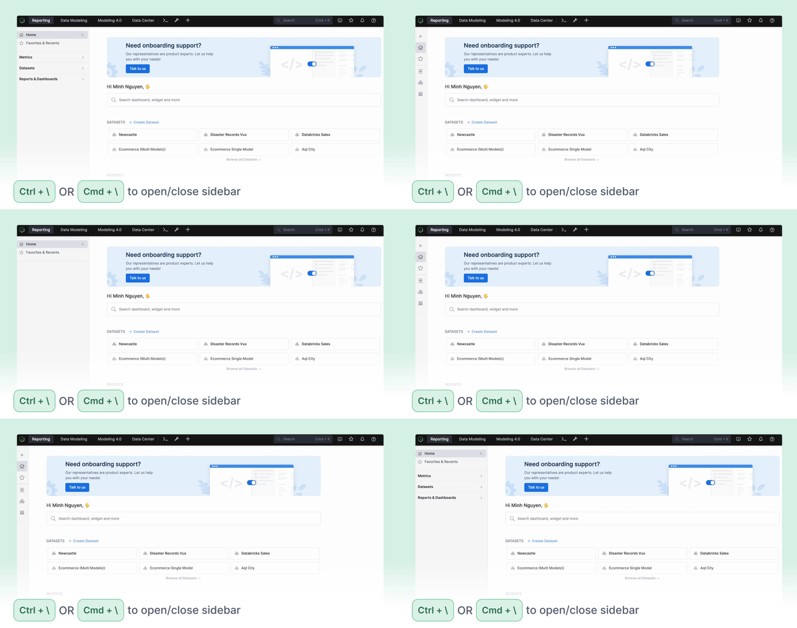
New hotkey alert: Press Ctrl + \ (Windows)
or Cmd + \ (Mac)
to toggle the Holistics sidebar.
You can now resize the width of table columns. This change is temporary, and doesn’t affect the default width of the column. You can also bring it back to default width by double-clicking on the resize hover
Continuing our commitment to improving Holistics performance, we proudly introduce Job Performance Analytics Dashboard.
With Job Performance Dashboard, you can:
To get access to the Closed Beta, sign up here:
Job Performance Analytics Early Interest Form. And if you have any feedback or suggestions for us, we’d love to hear.
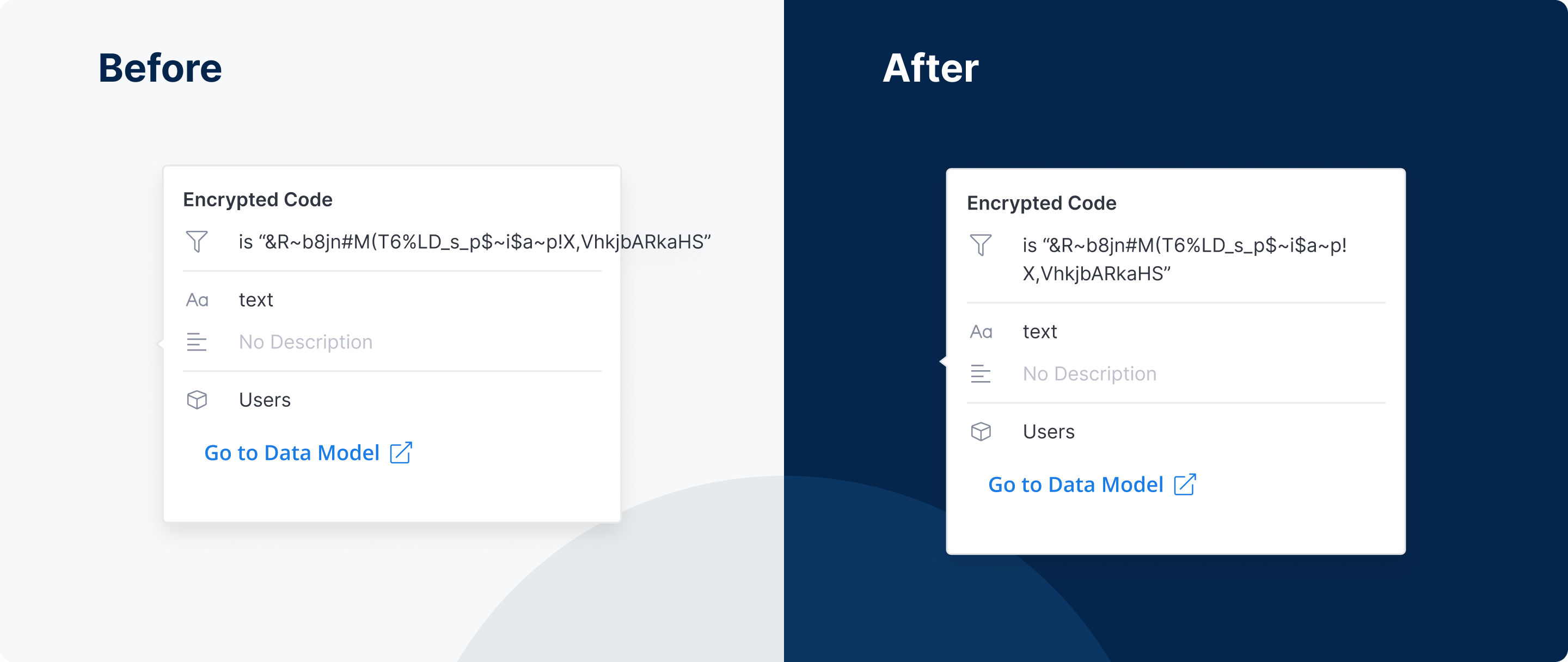
Overflow text in fields’ popover in the Visualizations panel now wraps correctly.
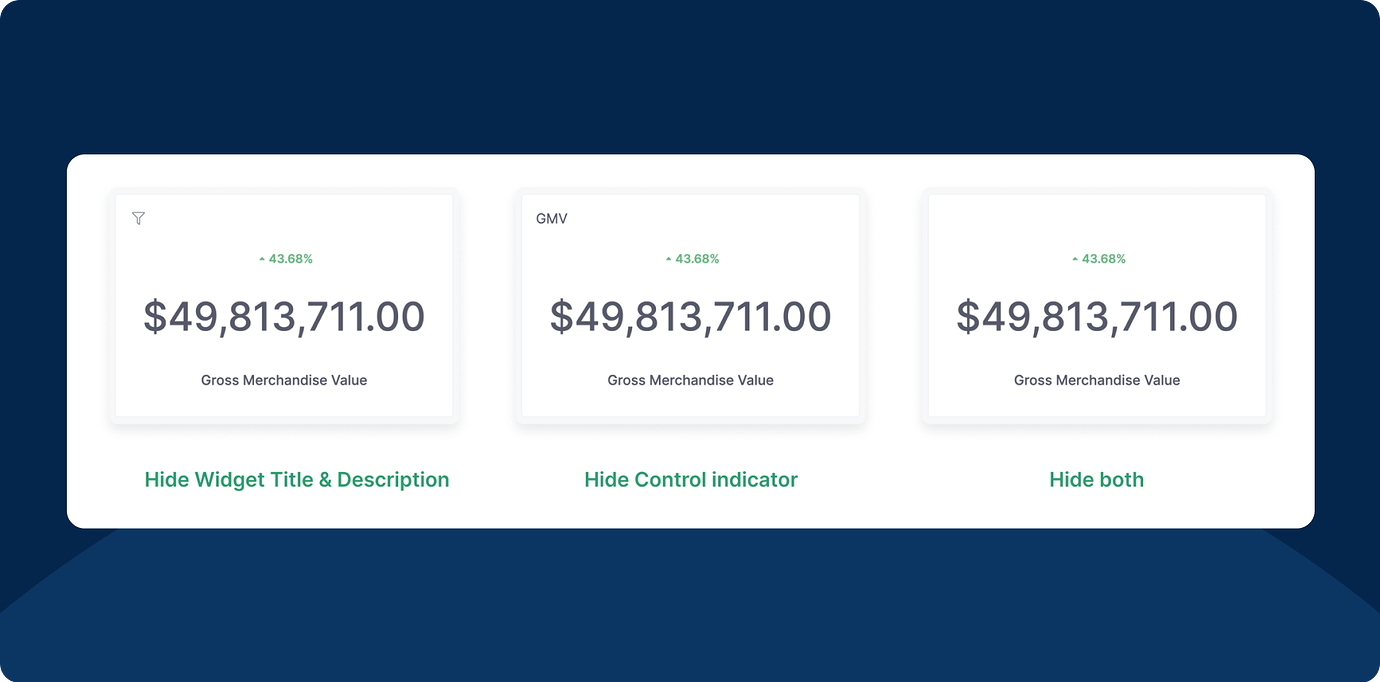
We added a new display setting in the Widget Preferences modal. You’re now able to hide some of the widget’s information.
We’ve recently released an improved version of our dashboard data drills, where you can add multiple date drills to your widgets. The results also persist in export and schedule.
Starting from now, you can monitor your Job Queues and Workers in real-time.
Head to our docs to learn more!
Are you concerned about Dashboards making unnecessary runs when users open it?
Check out how to Disable Dashboard Auto-run!
Our new table improvements have made rendering speed 3x faster compared to the previous version. In addition, we've made scrolling smoother, reduced popover load times, and more.
Check out this video to see the new Table in action:
Please note that this speed upgrade is all about visualization rendering. It doesn't affect query speed. Though, please rest assured we are working constantly to cover that, too!
P.S. We are working on similar upgrades for our Pivot table visualization, also. So please stay tuned!
We’re excited to announce that our integration with Databricks is now available, allowing you to combine the robust, scalable data processing power of Databricks with Holistics’ governed self-service platform.
For more information, check out our docs here.
Freeform layout is the most exciting feature in our upcoming Dashboard As-Code: You can drag-and-drop charts around to create space for context, give explanations, structure a business-friendly narrative, answer audience questions before they ask them, and build dashboards that spark stories, not boredom.
Better yet, everything on the dashboard is customizable using either a GUI or a Code-based Editor. The possibilities are abundant. You can turn it into a landing page, a Notion page, or any type of consumption interface that’s friendly to your viewers, and make it explorable with PoP or Data Drill, both of which were recently added to our Dashboard As Code.
How do you see this feature being useful to your team? If you have any feedback or suggestions for us, please share them here. We’re all ears.
Timezone is annoying. You can create the best dashboard in the world, but it won’t be really useful when timezone conflicts hit. Luckily, you’ll soon have a simpler way to manage your dashboard timezone, ensuring accurate data delivery to your customers.
With this feature, you can:
For more details, you can check out our public docs here
You've sweated over every detail of your product, so we want to make sure Holistics reporting fits right in. You can now further customize your embedded dashboards by hiding filter and header panels.
Interested? You can test out these new updates on our Embedded Dashboard Sandbox here.
They say “All roads lead to Rome”, we say “But some are faster than others”.
There are many ways to get on with Holistics 4.0, and we want to bring you on the quickest path. In October, we introduced an upgraded flow to help your onboarding experience with 4.0 as effortlessly as possible. You’ll be guided throughout the whole process - from your first data source connection to your first datasets, and to your first report.
You can just follow the flow, click, clack, sit back, and relax.
On Oct 12, we released Lazy-rendering Widgets, as part of our effort to further improve Holistics dashboard performance.
Lazy-rendering make sures that all widgets are executed when the dashboard is opened, but only those currently in the viewport are actually rendered. As a result, the initial loading of each dashboard becomes significantly faster and more responsive.
In contrast, without lazy-rendering, every widget would execute and render as soon as the dashboards are opened, resulting in an accumulation of widget renderings and causing the browser to become sluggish.
And because actions speak louder than words, let's go through a quick demo here. :)
In the below demo videos, we're using a dashboard with 20 Pivot Tables.
Before Lazy RenderingIt took nearly 10 seconds for the Dashboard to be responsive. This gets worse as the total number of widgets in the Dashboard goes up.
After Lazy RenderingIt took 1-2 seconds for the Dashboard to be responsive!
More performance optimizations and features are on the way! If you have any questions or feedback for this functionality, feel free to share it here.
In October, we’re making some great updates to our Dashboard As Code, making it easier to build reports using code and have fine-grained control over viz, layout, content, and reporting architecture.
We started testing this internally this month and can't wait to share with you a short demo - but before we get to it, here’s a peek at how here’s a peek at how some of our data team has been using it:
With this feature, analysts will soon be able to adopt software best practices in your dashboard development. Through codification, you can have full control over the content and design of your dashboards, easily revert changes, make bulk updates, and have customized and reusable visualizations everywhere.
If you’re as excited as we are, stay tuned. We’re running as fast as we can to get this on your hands! :) Without further ado, here’s the new demo.
How do you see this feature being useful to your team? If you have any feedback or suggestions for us, please share them here. We’re all ears.
P/s: We had a lot of fun testing this feature. Our team was even able to whip up a Pokedex dashboard in just a few minutes.
“What is this dataset about? How should I use it? Who can I contact to learn more about using this dataset?”
Sounds familiar? Business users need to really understand a dataset to self-serve effectively. This is why how you present a dataset is as important as how you design it.
From now on, you can write markdowns to add Descriptions to your dataset, making it easier for business users to navigate and explore the data you’ve prepared.
Have any feedback or questions? Share it here with us.
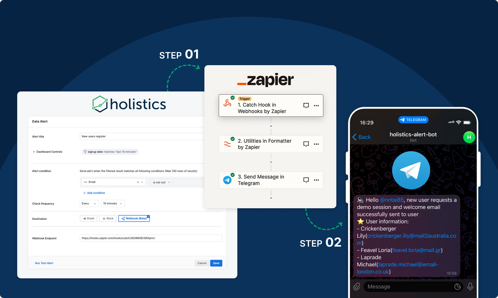
We believe that data should inform action and the faster you can act, the better. This is exactly why we are working on Webhook for Data Alert - a major upgrade to Holistics Delivery capability.
With this, you can quickly set up automated workflows for critical internal communication, like:
We value your feedback, so please don't hesitate to share your thoughts and suggestions.
Our PoP has been a hit with our users because it takes just 03 clicks to uncover data trends over time - but things got a lot more laborious when you want to compare:
The problem? Two arbitrary time periods. Different start dates. Different end dates.
🥁🥁 Glad to share that this is a problem of the past! With our newly released Custom Period, you can easily select any date range for Period-over-Period comparison.
If you have any feedback for us, we're all ears.
What makes a good coding IDE? Among other things, it helps you spend as little time on troubleshooting as possible.
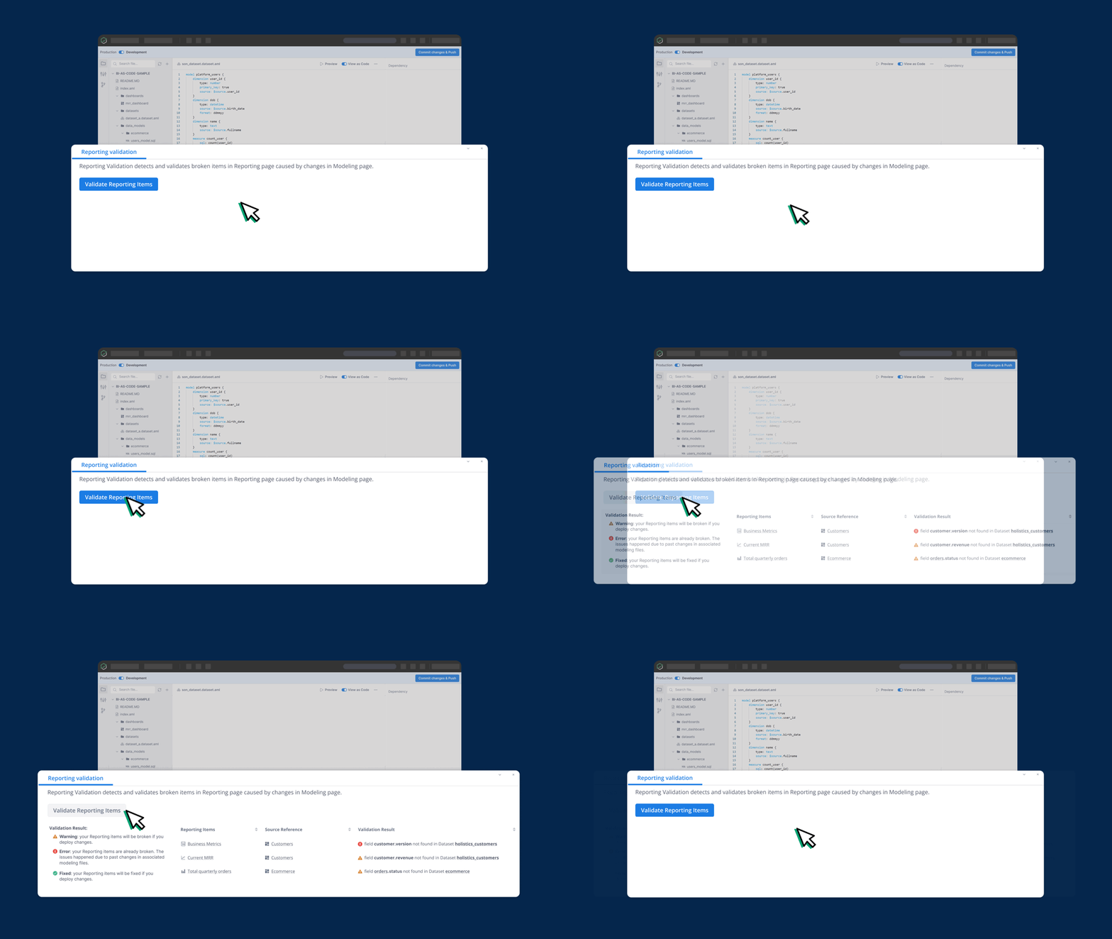
With Reporting Validation, you take the guesswork out of your modeling workflow. Holistics IDE now tells you exactly which reporting items are broken due to Modeling changes - before you roll out these changes and lets you patch up all those broken reporting items swiftly and en masse.
P/s: We’re always excited to ship new features, but we’re way more excited when we get to build things that you all have asked us for. Take this new feature for a spin, and keep the feedback coming.
We have released a new option in Single-select List filter settings, where you can allow your dashboard viewers to leave the value field empty.
With this feature active, an empty value can be used without the need to apply the filter. We believe this change offers more flexibility and command over your filtering choices
We value your feedback, so please don't hesitate to share your thoughts and suggestions with us.
Query Timeout helps you abort any query that exceeds your timeout limit and takes too much time and resources.
However, previously in Holistics, the Query Timeout setting was only available for Postgres, Redshift, and MySQL databases. Understanding the importance of resource optimization - especially in our current economic climate - we’ve gradually expanded our support for Query Timeout in most SQL databases - making it also available for BigQuery, Snowflake, Microsoft SQL Server, ClickHouse, and AWS Athena.
Learn more here.
If you have any feedback for us, we're all ears.
We totally get it - feels like time's standing still when you wait for a dashboard to load.
We hate the loading screen as much as you do so we’ve been rolling out a new API - Dashboard Preload API - to help you preload the cache of your most frequently used or operationally critical views of your Dashboards so that they can be loaded in an instant.
This means no waiting time - not even enough for a quick coffee break :) Learn more here.
What do you think? Feel free to share your feedback and suggestions here, we'd really appreciate it.
Period Comparison was a hit with a lot of our users as it allows anyone to get insights into how data fluctuate over time. However, previously in Holistics, Period Comparison could only be set up by data analysts. Viewers don’t have the option to turn it on/off freely.
Recognizing the inconvenience and the growing demands for a more unified experience, we took a step forward: Period Comparison is now available at the dashboard level.
Dashboard explorers can now choose to apply the same comparison to numerous widgets within a dashboard and get a bird-eye view into how multiple metrics are changing over time.
What do you think? Feel free to share your feedback and suggestions here, we'd really appreciate it.
Is there a way to customize what fields in the model and dataset are being shown to end users for self-serve exploration? Otherwise, my users are overwhelmed by the sheer amount of fields available.”
Yes, we heard you. Introducing dataset views, where you can curate exactly what the end users will see.
This feature is now immediately available to all 4.0 customers. Learn more here.
What makes a good coding IDE? Among other things, it should tell you where your code got wrong, and how to fix them.
Well, we just made our coding IDE a little better: When doing analytics development, Holistics IDE now tells you where your modeling code is broken, and what exactly is wrong with them.
If you have any feedback for us, we're all ears.
With an expanded range of data formats for both visualization settings and modeling, presenting dates the way you like - has never been easier.
What do you think? Feel free to share your feedback and suggestions, we'd love it!
Say goodbye to maintaining dashboards with only gut feeling - Because Holistics just released the BI equivalent of God-eye from Fast and Furious 07.
This feature gives admins a bird-eye view of dashboard usage & user activity, making it a lot easier to understand how your dashboards are being used.
Dashboard maintenance will be much less painful when you know precisely which dashboards are used by whom and how often.
In this official launch, we’ve released a plethora of upgrades to our Usage Monitoring - including Lists of dashboards with no view, Tracking of Private Dashboards, Performance improvements, and many more…
You can read more about it here: 🎬 Usage Monitoring: Beta Program Ending & Official Release | Holistics Community
With Dashboard Metadata, you can quickly glance over the dashboard descriptions and know who made it, when the last edit was made, or who frequent viewers are, and more. We hope this will help you foster better cross-functional collaboration by providing more visibility into how your organization creates and shares reports.
Your can learn more about this feature here: Dashboard Metadata | Holistics Docs, or share your feedback with us in our community post.
Holistics now allows pasting a list of CSV values directly from clipboard into the filters. This seemingly small upgrade is much requested by our users. Small details matter.
How does this small feature help?
Learn more here: Mass input a list of values for Filter & Condition
AQL Expression is the next-gen upgrade to our current Business Calculation mechanism, designed to give you a more powerful and flexible way of querying data for various analytics purposes, including but not limited to:
Let’s say you are a Country Manager of an Ecommerce Company and you want to calculate the Revenue by Country.
The formula to calculate it is the sum of the product price (from the Product model) multiplied by the quantity (from the Order Items model).
They are from 2 different models so you can write an AQL expression like the video below
Sample syntax
sum(order_items.quantity) * 1.0 /
eval(sum(order_items.quantity),exclude(users.age_group))
With AQL Expression, you can perform Subgroup Calculations flexibly and easily without having to create SQL (or transform) Models.
Here's the sample syntax:
sum(order_items.quantity) * 1.0 /
eval(sum(order_items.quantity), exclude(users.age_group))
Learn more here: [Upcoming] Our brand new Analytics Query Language, AQL!
Holistics is currently working on a significant improvement to our Modeling layer called “Dynamic Models” (feature request). This feature allows analysts to define reports that can take user inputs, and inject them directly into a model/report definition.
This feature is currently under development and is expected to be released in beta end of Q2 2023. Once released, it will only be available in Holistics 4.0.
How it works:
One of our latest developments is Date Parameter which will be available in our upcoming beta release. To create a Date Param and use it in the SQL definition of a Query Model, you just need 02 steps:
param created_at_param {
label: 'Created At Param'
type: 'datetime'
}
SELECT ...
FROM ...
WHERE {%filter(created_at_param) %} date_column {%end %}
That’s it. And it’ll look like this in action. (You can also watch the video version here).
Learn more here: Upcoming Launch: Dynamic Models (aka Query Parameters)
Imagine running a marathon in flip-flops. It can be done - but at what cost?
An efficient keyboard is like a pair of top-notch running shoes - it just makes the journey more bearable, especially when you're sprinting through heaps of data. This is why we’ll be introducing a new array of exciting features to help you keyboard-sprinting through data - instead of flip-flopping through it :)
We’ll be rolling out the following features:
If you have any feedback for us, feel free to share it here.
We have upgraded our Users APIs with much more power, such as delete, restore, resend invites, and more! Now it’s ready for you to take the workflow automation of User Management to a whole new level! 👆
Check it out at Users API Package | Holistics Docs.
This feature will help you change the timezone where your data is processed and displayed.
For example, if your business operates in Singapore, you will probably want every calculation to be handled in UTC+08:00.
For more information and detailed instructions, please refer to our public documentation: Timezone Settings | Holistics Docs
We value your feedback, so please don't hesitate to share your thoughts and suggestions with us.
The highly-requested Relationship Diagram for Holistics As-code (Holistics 4.0) is finally here.
Going forward, you have the option to work with your relationships in the Diagram view beside the usual List view.
(It's like choosing between a hearty medium-rare steak and a creamy and cheerful lemon cheesecake - having one is good, but having both is even better!)
Learn more here: Launch: Relationship Diagram for Holistics As-Code
Fresh out of the oven: API for Updating Data Source!! 🥳
More details here if this is something you're interested in you: Data Sources API Package | Holistics Docs.
We're glad to announce that we have recently achieved Select Tier partner status as part of the Snowflake Partner Network, solidifying our robust relationship with Snowflake and reaffirming Holistics’ commitment to data cloud’s best practices for product integration.
We hope that with this partnership, Holistics customers continue to derive greater value from data by enabling your entire organization to easily access, explore, and visualize data - enabled by Holistics’s self-service functionalities on top of Snowflake’s fast, flexible, and scalable data platform.
Read our full announcement here: Press Release: Holistics Achieved Select Tier Partner Status with Snowflake
With the latest search improvements, you're now able to experience:
If you have any feedback or suggestions for us, we're all ears!
The new My Account users allow Holistics users to manage personal information - making it easy for you to connect with other users on the platform.
You can spruce up your profile photo using Gravatar, and add your name, job title, and department, easily update your password to keep your account secure. If you need access to the Holistics API, you can also find your API key on this page.
Learn more here: User Profile
AML Studio is getting a fresh UI update that's gonna make things a lot clearer for users.
With the new update, you will have a much easier time telling which mode - Production Mode or Development Mode - they're in. Less error-prone, more intuitive for everyone.
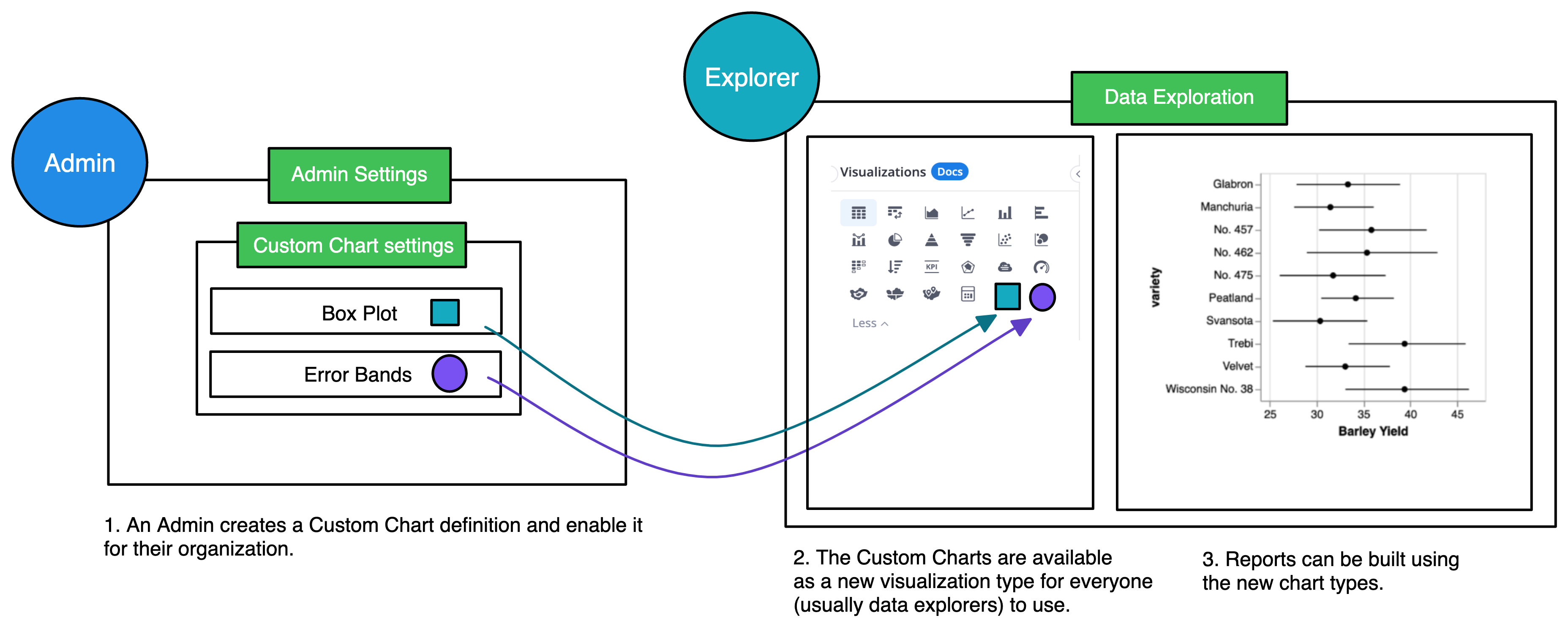
Sometimes, Holistics' default visualization types may not be enough for your business needs. You may want to use charts that we do not support yet, or create a more customized chart type with modifications specific to your organization. The Custom Chart feature is, therefore, introduced to help you create custom, reusable chart templates that accommodate your needs.
Custom Charts are user-defined chart templates written using Holistics and Vega-lite syntax. Once created, it is available to everyone in your organization to use. The creation of a Custom Chart typically follows these steps:
Check out our full tutorial here.
Sankey Chart is a type of visualization that represents the movement of data from one entity to another. Whether your marketing team wants to know how users move from one page to another and where they drop off.
Or your management team wants a visualization of how the budget is allocated across different departments or projects. Sankey Chart can get it.
And we’re proud to share that now you can create a Sankey diagram in Holistics - via our Custom Charts feature! Check our release note here for more details: Launched: Sankey diagram in Custom Charts | Holistics Community.
Admin users can now use our newly released APIs to programmatically invite multiple users, retrieve a list of users, and update their information.
For additional information, please refer to our public document at the following link: Holistics API | Holistics Docs
This comprehensive package offers full configuration for data alerts related to specific data events, including:
For additional information, please see our community post here: Launched: Data Alert API Package