How to create a Point Map?
What is Point Map?
Point maps plot geographic latitude/longitude data to visualize the location of data on a map. The point is identified by either a value or a subject.
Types of Fields
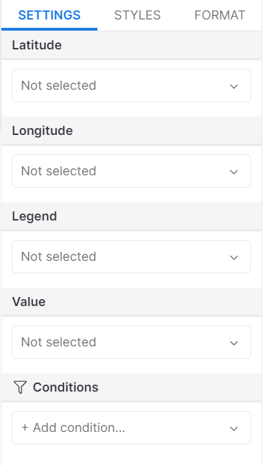
- Latitude and Longitude: represent the geographical coordinates of each location.
- Legend: The legend field provides additional information or categories to distinguish and classify the data points on the map. It can be used to assign colors, symbols, or labels to represent different groups or types of data.
- Value: The value field represents a numerical or quantitative attribute associated with each data point.
- Conditions: The condition field allows for the application of filters to selectively view data points based on specific criteria or requirements.
Creating a Point Map
📝 Goal: Following these steps to visualize the listings of Airbnb homestays in Asheville (North Carolina, USA):
Sample data
- Dataset: Google Sheet link.
- For more information on importing data from the Google Sheet link into Holistics., see How to import data.
Step 1: Select the Point Map icon from the visualization pane
![]()
Step 2: Define the Location
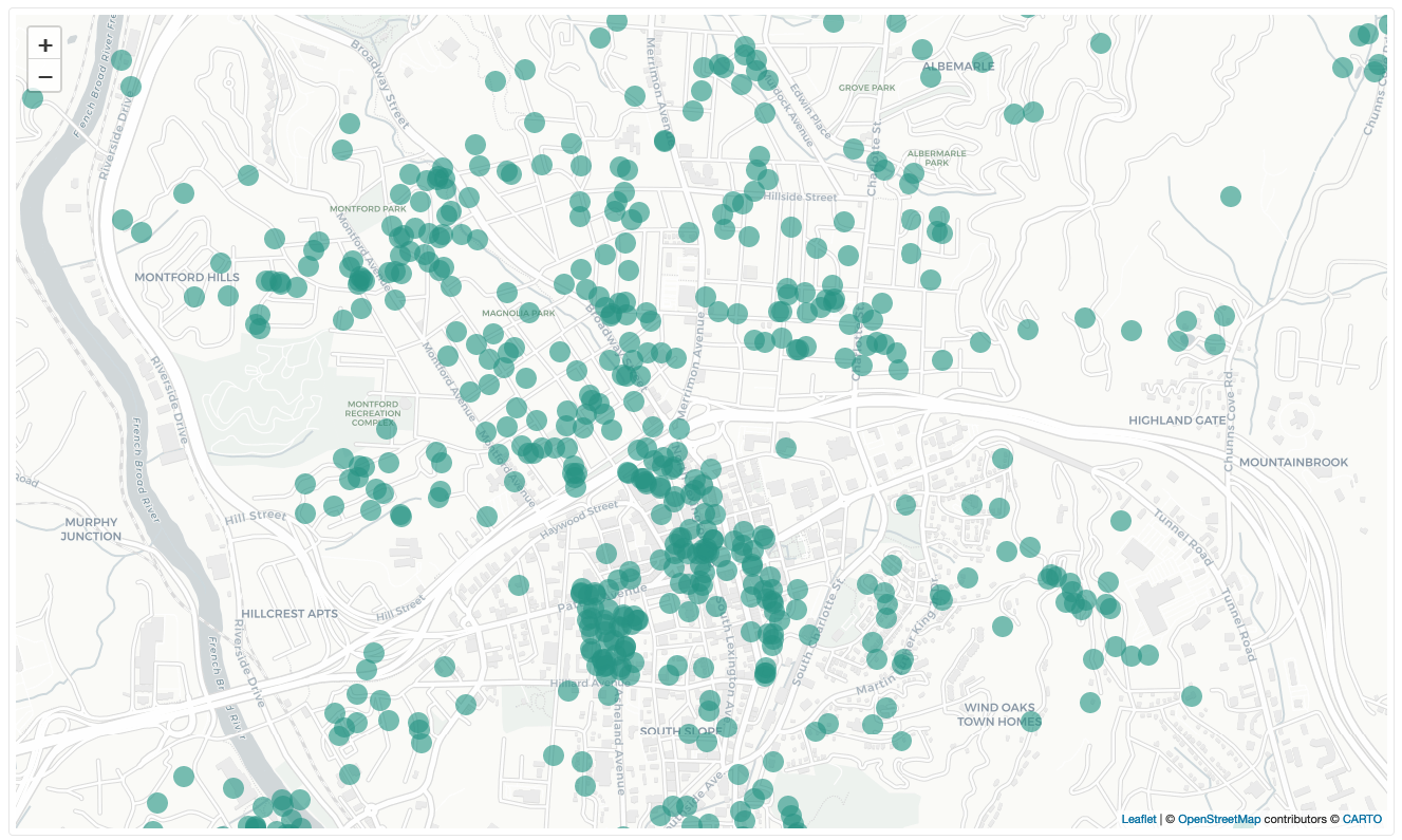
In the Viz settings, drag or type your latitude and longitude values into the Latitude and Longitude fields, respectively.
If you click on Get Results, Holistics will display a plain one-color map with equal-sized bubbles.
Step 3: Add Statistical Meaning
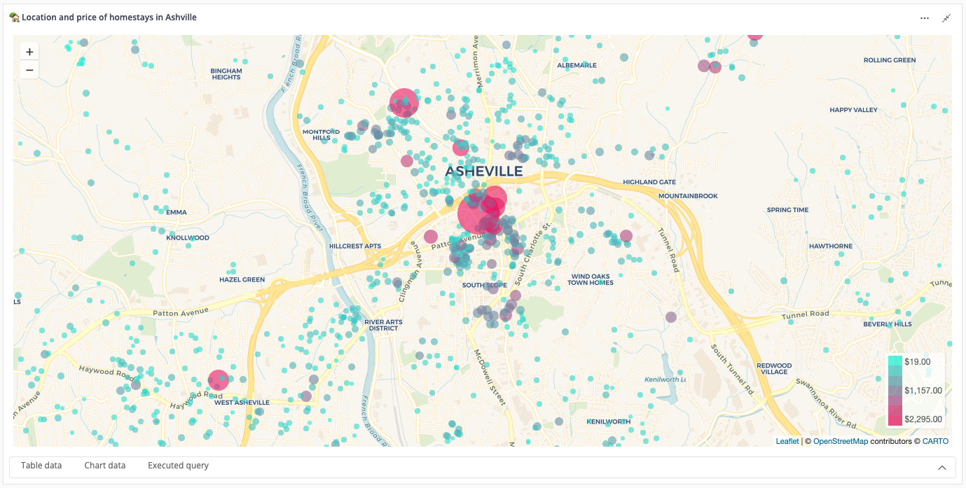
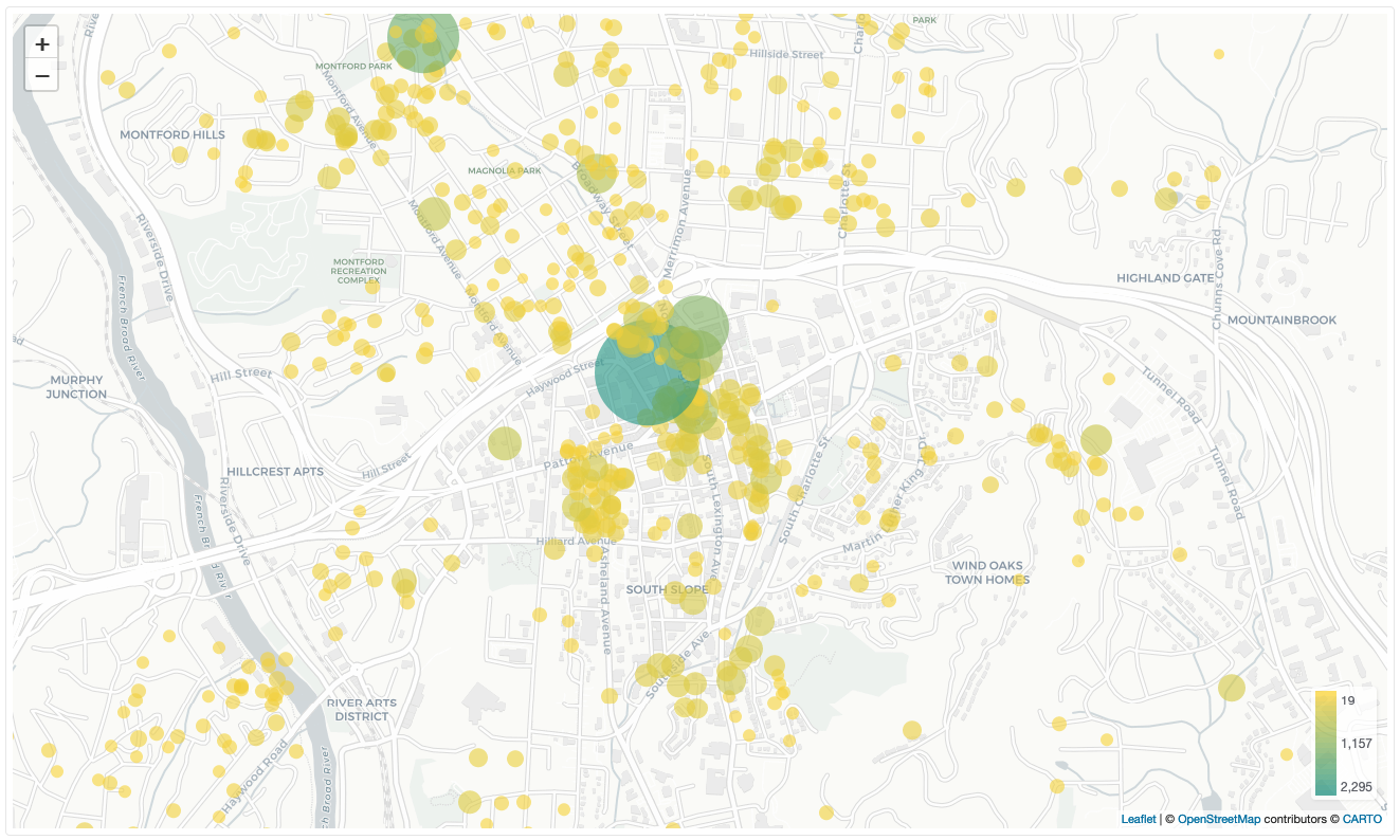
To add statistical meaning to your map, include a numeric measure such as Price in the Value field. Click on "Get results." You will notice two changes:
- The bubble sizes change based on the values they represent. Larger values result in bigger bubbles.
- The color of each bubble changes, with greater values being represented by a "greener" color.
Step 4: Customize the Map
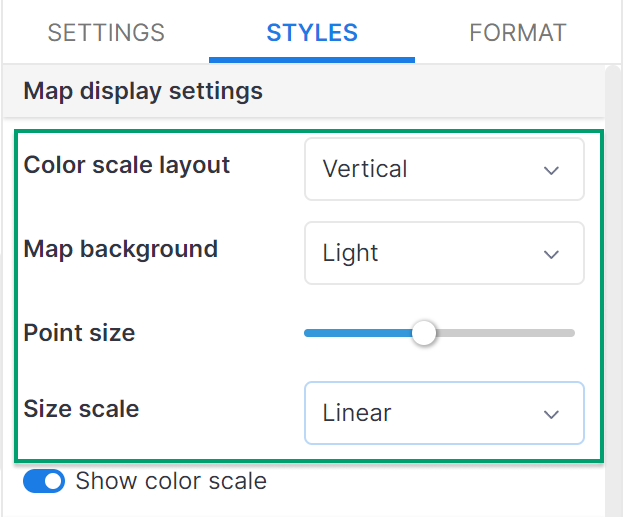
To improve the appearance of your map, go to the Styles tab and make the following adjustments:
Color scale layout: Choose between vertical or horizontal positioning of the color scale.Map background: Select from five options: Light, Dark, Street, Satellite, or Outdoor.Point size: Adjust the size of the points on the map using values from 1 to 10.Size scale: Modify how the data is calculated by choosing between Linear or Logarithmic scaling.
Step 5: Customize Bubble Colors
To further customize the colors of the bubbles, under Color Formatting section:
Click on
Set Color By…to choose a field to apply color to your map. Once you've selected a field, you'll see the following options:Click on the color scale in
Styleto change the color scheme of the map.Select
Smoothto generate a color gradient for both the map and the scale.Choose
Stepsto divide the color scale into blocks, each representing a range of values. For example, if the data ranges from 0-100 and you set 5 steps, there will be 5 corresponding color blocks: 0-20, 20-40…
Min-Mid-Max: By default, these fields are set to Auto, but you can change them to Number or Percent from the drop-down list on the left of the input field. Once changed, enter your own values, and the color scale in the Style section will immediately reflect the updates.
If your input data for min or max is out of range (e.g., your data range is 1-100, but you input 101 in min), Holistics will use the maximum color as the displayed color. If your input data for mid is out of range (e.g., you enter 1000 in mid), Holistics will not make any changes to the color scale.
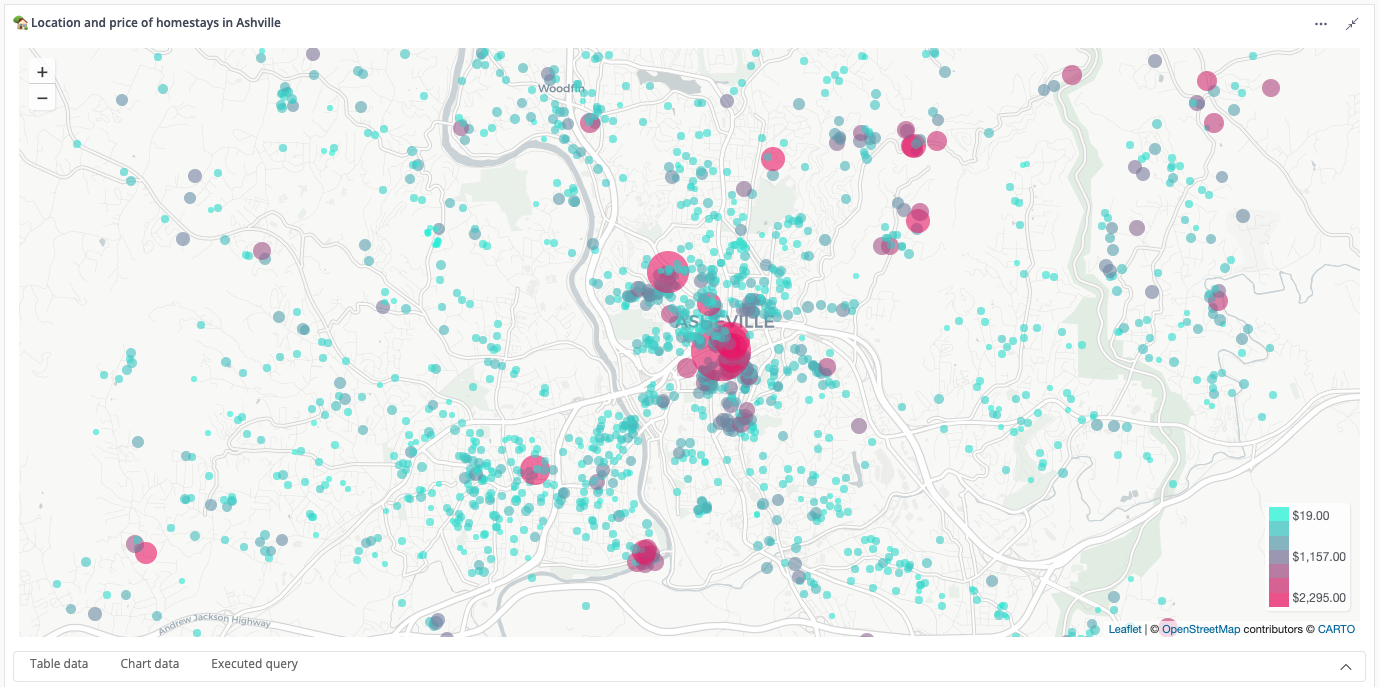
Final Result
With these steps, you can create your final point map.
