Custom Chart properties
Chart definition properties
CustomChart {
  fields {
    field (multiple) {
      label (optional): String
      type: 'dimension' | 'measure'
      sort (optional) {
            apply_order (optional): Number
            direction: 'asc' | 'desc'
          }
      data_type (optional): 'string' | 'number' | 'boolean' | 'date'
    }
  }

  options (optional) {
    option (multiple) {
      label (optional): String
      type: 'input' | 'number-input' | 'toggle' | 'radio' | 'select' | 'color-picker'
      options (optional): Any
      default_value (optional): String | Number | Boolean
    }
  }

  template: @vgl {
        // Vega Lite JSON Specifications
  };;
}
Field definition properties
Syntax: field <field_name>
type (string)
Description: Specify if the field is a dimension or measure. If you set “measure”, any field dragged in this section will be aggregated.
This is a required field.
All valid values for type are: “dimension” || “measure”.
Note: Example charts from Vega-Lite library usually define aggregation within their codes, therefore you do not need to aggregate once more in Holistics. If you reuse those codes, it’s recommended to use the type “dimension” for all fields.
label(string)
Description: The field name, displayed in visualization settings to help users understand what it means.
This is an optional field.
sort (field)
Description: sort has two properties:
direction: Specify the direction that the field should be sorted. All valid values fordirectionare: "asc" || "desc".apply_order: Specify the order that the field should be sorted relative to other fields. Accepts a numeric value.
This is an optional field.
data_type (string)
Description: Limit the type of data that users can drag into in the exploration screen.
This is an optional field.
All valid values for type are: “string” || ”number” || “boolean” || “date”.
Option definition properties
Syntax: option <option_name>
type (string) (required)
Description: This property determines how the option will be displayed in the STYLES tab.
All valid values for types are: "input" || "number-input" || "toggle" || "radio" || "select" || "color-picker".
"input" type
Description: This type of option renders a text input in the Settings section, and will accept a text input from users.

Sample code:
option my_text_input_option{
    type: 'input',
    default_value: 'Some default value here'
}
Notes:
After defining this option, you can access its value using this syntax:
@{{ options.my_text_input_option.value }}
"number-input" type
Description: Similar to "input" option, but only renders/accepts a numeric value.

Sample code:
option my_number_input_option{
    type: 'number-input',
    default_value: 1
}
Notes:
- After defining this option, you can access its value using this syntax:
@{{ options.my_number_input_option.value }}
"option" type
Description: This option type renders a toggle element, and accepts a Boolean value (true/false).

Sample code:
option my_toggle_option{
    type: 'toggle',
    default_value: false
}
Notes:
- After defining this option, you can access its value using this syntax:
@{{ options.my_toggle_option.value }}
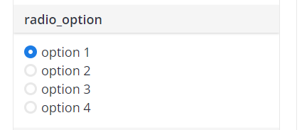
"radio" type
Description: This option type renders a radio list, and accepts a value from a predefined list.

Sample code:
option my_radio_option{
    type: 'radio',
    options: ['option 1', 'option 2', 'option 3', 'option 4'] // list all your options here
    default_value: 'option 1'
}
Notes:
- After defining this option, you can access its value using this syntax:
@{{ options.my_radio_option.value }}
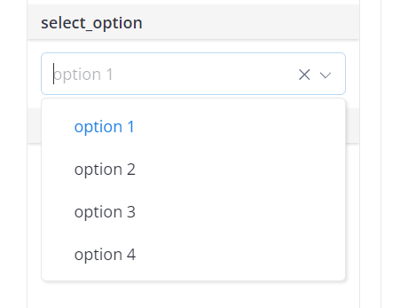
"select" type
Description: Similar to radio option, but renders a select box instead.

Sample code:
option my_select_option{
    type: 'select',
    options: ['option 1', 'option 2', 'option 3', 'option 4'] // list all your options here
    default_value: 'option 1'
}
Notes:
- After defining this option, you can access its value using this syntax:
@{{ options.my_select_option.value }}
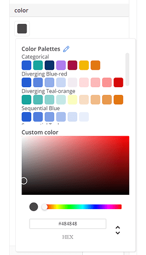
"color-picker" type
Description: This option type renders a color picker, and resolves the selected color hex code.

Sample code:
option bar_color {
    type: 'color-picker'
    label: 'Bar color'
    default_value: 'cyan'
}
Then to reference it in the Vega Lite JSON encoding. Sample as below:
"mark": {
    "type": "bar",
    "width": 20,
    "tooltip": @{options.tooltip.value},
    "color": @{options.bar_color.value}
}
options (string)
If you set type as “select” or "radio", you are required to specify the option values users can choose from by this property. Otherwise, this property is optional.
label (string)
Description: It specifies the label to be displayed in Visualization settings for the Option.
This is an optional field.
default_value (string/number/boolean)
Description: This defines the value the option will take by default.
This is an optional field.
Runtime data
Runtime data is the data generated while the code is running. It is not possible to pre-define any value for this type of data. You can use runtime data in the Template definition of Custom Chart.
field <name>
nameRefer to the current field with all of its pre-defined properties.
formatRefer to the current field’s format
typeRefer to the current field’s data type
option <name>
valueRefer to the current option with all of its pre-defined properties
Examples
Suppose we have a Custom Chart definition as below:
CustomChart {
    fields {
        field a {                    // "a" is the field name
            type: "dimension"
            label: "field a"           // displayed in Visualization Settings
            sort {
                apply_order: 1           // this field will be sorted first
                direction: "asc"         // sort direction: ascending
            }
        }
        field b {
            type: "measure"            // any field dragged here will be aggregated
            label: "field b"
            sort {
                apply_order: 2           // this field will be sorted second
                direction: "desc"
            }
        }
    }

    options {
        option tooltip {
            type: 'toggle'
            label: 'Show tooltip'
            default_value: true
        }
    }

    template: @vgl {
        "data": {
            "values": @{values}
        },
        "mark": {
            "type": "bar",
            "tooltip": @{options.tooltip.value},
        },
        "encoding": {
            "x": {
                "field": @{fields.a.name},
                "type": "nominal",
            },
            "y": {
                "field": @{fields.b.name},
                "type": "quantitative"
                }
            }
    };;
}
Suppose the user drags Created_at field into field a and Revenue field into field b. During runtime, the data is returned as below:
{
    "data": {
    "values": [
      {"a": "01/01/2022", "b": 28},
            {"a": "01/02/2022", "b": 55},
            {"a": "01/03/2022", "b": 43},
    ]
  },

    fields: {
        a: {
            name: "Created_at"         // see @{fields.a.name} in the definition
            type: "date"               // data type of the field user drags in field a
            format: "mm/dd/yyyy"       // format of the field user drags in field a
        }

        b: {
            name: "Sum of Revenue"     // because the field is aggregated
            type: "number"
            format: "Number (rounded)"
        }
    },
  options: {
        tooltip: {
            value: true          // see @{options.tooltip.value} in the definition
        },
    }
}