Custom Charts: Tips and Tricks
Tips and Tricks
1. Quickly know how many fields you should define
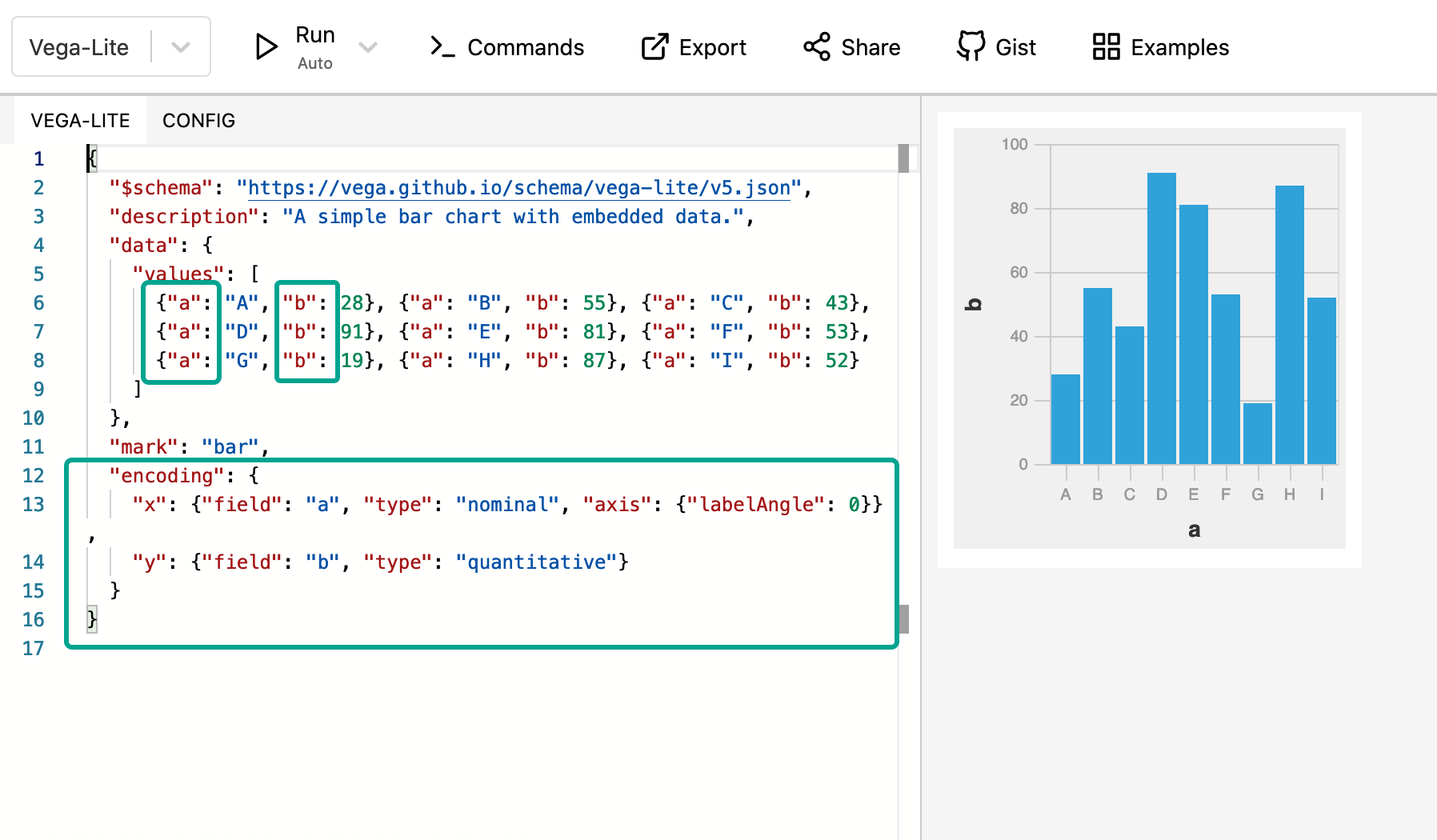
To know how many fields are required for the chart, you can look at the sample data or at the “encoding” section to see how many fields are defined.
In the example below, we can see that there are two fields required: “a” and “b”.

2. Avoid repetition of field referral statements
If you need to refer to a field many times in the code, you can use “transform” property to assign a string interpolation to a constant.
For example, we have two fields x_axis and measure and we don’t want to repeat writing @{fields.x_axis.name} and @{fields.measure.name} later in the code. We will assign them to “label” and “amount” respectively as below:
"transform": [
    {
        "as": "label",
        "calculate": "datum['@{fields.x_axis.name | raw}']"
    },
    {
        "as": "amount",
        "calculate": "datum['@{fields.measure.name | raw}']"
        }
]
3. Customize the overall look of the chart
Vega-lite provides plenty of pre-defined themes for your visualization.
When you view an example from the Vega-Lite library, click on "View this example in the online editor” to open the Vega editor.

Navigate to the CONFIG tab, choose your preferred theme, then copy all the code displayed on the screen

In your Chart definition, create a property called
"config"at the root level of “template”. Copy and paste the code snippet of the theme into this"config"property. Click Submit and enjoy the result!